How to use Material UI (MUI) Table with Next.js

Tables are data structures that are very helpful to organize data based on columns and rows.
In Next.js, there are multiple libraries that you can use to easily build your tables and use their APIs to populate data.
In this tutorial, we are going to see how to see to create table in Next.js using Material UI
Material UI (MUI) and Next.js
MUI provides a robust, customizable, and accessible library of foundational and advanced components like tables, buttons, App bar… which then let you build your Next.js applications faster. One of the core features for which Material UI is better than Antd is the fact that MUI components are responsive and Antd are not, so they are more adapted for mobile use also.
Setup Material UI (MUI) in Next.js project
To start, let’s first setup MUI in Next.js project, to do so, open a terminal, head to your project root directory, and type in
// using npm
npm install @mui/material @emotion/react @emotion/styled

// using yarn
yarn add @mui/material @emotion/react @emotion/styled
Once finished, you may be able to see that these packages has been added to package.json
Customize Material UI (MUI) table
To use MUI table in your project, you can choose between different styles offered by the framework, The API offers to populate the Table Header, and the table cells using a data source, you can also color specific lines if you wish to.
MUI Table header
To populate The Table Header, use TableHead provided by MUI, the data source could be populated by an external API or some internal data
import TableHead from '@mui/material/TableHead';
import TableRow from '@mui/material/TableRow';
import {styled} from '@mui/material/styles';
import TableCell, {tableCellClasses} from '@mui/material/TableCell';

const header = ['row1', 'row2', 'row3'];

const StyledTableCell = styled(TableCell)(({theme}) => ({
	[`&.${tableCellClasses.head}`]: {
		backgroundColor: theme.palette.common.black,
		color: theme.palette.common.white
	},
	[`&.${tableCellClasses.body}`]: {
		fontSize: 14
	}
}));

const toto = () => (
	<TableHead>
		<TableRow>
			<StyledTableCell>{header[0]}</StyledTableCell>
			<StyledTableCell>{header[1]}</StyledTableCell>
			<StyledTableCell>{header[2]}</StyledTableCell>
		</TableRow>
	</TableHead>
);

export default toto;
In the example above, the Table header has a black background color with white font color
To change header background color, we use styled component from material/styles and apply background color, font color to our head tableCellClasses.
The results are as below:

Color specific line in Material UI (MUI) table
//define blue background color for cell

const ColoredTableCell = styled(TableCell)(({theme}) => ({
	[`&.${tableCellClasses.head}`]: {
		backgroundColor: theme.palette.common.black,
		color: theme.palette.common.white
	},
	[`&.${tableCellClasses.body}`]: {
		fontSize: 14,
		backgroundColor: '#60A5FA'
	}
}));

//define component to use based on data condition

const WhichTableCell =
	data['key'] === 'value' ? ColoredTableCell : StyledTableCell;
Center Text in Material UI (MUI) table
To center Text in MUI table, use the option align=“center” to the components props.
For example, you can check below component StyledTableCell to understand how it is can be done.
Render Material UI (MUI) table in Next.js
Let’s see how our full code will look like, we select a specific line to color in blue based on data, try and copy this code to find out the final results.
To do this, create a page called page.js under pages folder and copy this content to it
import {styled} from '@mui/material/styles';
import Table from '@mui/material/Table';
import TableBody from '@mui/material/TableBody';
import TableCell, {tableCellClasses} from '@mui/material/TableCell';
import TableContainer from '@mui/material/TableContainer';
import TableHead from '@mui/material/TableHead';
import TableRow from '@mui/material/TableRow';
import Paper from '@mui/material/Paper';

const StyledTableCell = styled(TableCell)(({theme}) => ({
	[`&.${tableCellClasses.head}`]: {
		backgroundColor: theme.palette.common.black,
		color: theme.palette.common.white
	},
	[`&.${tableCellClasses.body}`]: {
		fontSize: 14
	}
}));

const ColoredTableCell = styled(TableCell)(({theme}) => ({
	[`&.${tableCellClasses.head}`]: {
		backgroundColor: theme.palette.common.black,
		color: theme.palette.common.white
	},
	[`&.${tableCellClasses.body}`]: {
		fontSize: 14,
		backgroundColor: '#60A5FA'
	}
}));

const StyledTableRow = styled(TableRow)(({theme}) => ({
	'&:nth-of-type(odd)': {
		backgroundColor: theme.palette.action.hover
	},
	// hide last border
	'&:last-child td, &:last-child th': {
		border: 0
	}
}));

export default function CustomizedTables() {
	const header = ['row1', 'row2', 'row3'];
	const data = [
		['rl11', 'rl12', 'rl13'],
		['rl21', 'rl22', 'rl23'],
		['r31', 'rl32', 'rl33']
	];

	// const
	return (
		<TableContainer component={Paper}>
			<Table sx={{minWidth: 700}} aria-label="customized table">
				<TableHead>
					<TableRow>
						<StyledTableCell align="center">
							{header[0]}
						</StyledTableCell>
						<StyledTableCell align="center">
							{header[1]}
						</StyledTableCell>
						<StyledTableCell align="center">
							{header[2]}
						</StyledTableCell>
					</TableRow>
				</TableHead>
				<TableBody>
					{data.map((row) => {
						const WhichTableCell =
							row[2] === 'rl23'
								? ColoredTableCell
								: StyledTableCell;
						return (
							<StyledTableRow key={row}>
								<WhichTableCell align="center">
									{row[0]}
								</WhichTableCell>
								<WhichTableCell align="center">
									{row[1]}
								</WhichTableCell>
								<WhichTableCell align="center">
									{row[2]}
								</WhichTableCell>
							</StyledTableRow>
						);
					})}
				</TableBody>
			</Table>
		</TableContainer>
	);
}
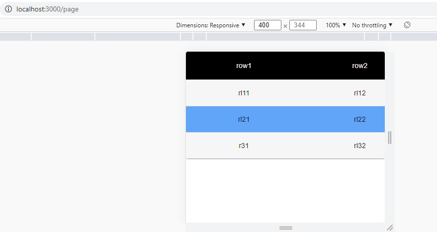
Responsive Material UI (MUI) table
Hit localhost:3000/page and try to narrow the screen, or use the phone icon when inspecting the page using chrome browser for example, the table is responsive and is adapting to screen size like the photo is showing
Conclusion
We have seen how to use Material UI (MUI) with Next.js project, how to use MUI tables, center text, and color specific lines based on data.
